 A blend of art and functionality of bathroom decoration into the bathrooms through high-end bathroom products which combine beautiful shapes with decorative elements, patterns and prints in vivid colors. An excellent example of the trend is Kos, a beautiful modern bathroom collection by Nova Linea. The collection features a simple, yet striking combination of both beautiful curved shapes and straight, sharp lines which combined create a really modern feel, further embellished by beautiful decorative patterns. Featuring a strong contrast of simple shapes and rich decorative patterns as well as color, and ridden of any excess details, such as cabinet door handles which could only disturb the harmony of elements, the beautiful and bold Kos compositions will easily steal the spotlight in any bathroom.
Thursday, October 30, 2008
Blend of Functionality and Art in Bathroom Decoration
 A blend of art and functionality of bathroom decoration into the bathrooms through high-end bathroom products which combine beautiful shapes with decorative elements, patterns and prints in vivid colors. An excellent example of the trend is Kos, a beautiful modern bathroom collection by Nova Linea. The collection features a simple, yet striking combination of both beautiful curved shapes and straight, sharp lines which combined create a really modern feel, further embellished by beautiful decorative patterns. Featuring a strong contrast of simple shapes and rich decorative patterns as well as color, and ridden of any excess details, such as cabinet door handles which could only disturb the harmony of elements, the beautiful and bold Kos compositions will easily steal the spotlight in any bathroom.
Monday, October 27, 2008
Clean looks interior design for Private residential
 Looks this bathroom near the stairs, soo personally...
 Tsao & McKown saw an opportunity to develop an architectural vocabulary that would serve the spirit of the Federal facade and staircase, yet imbue the new interior with modern sensibilities. The entry foyer fireplace, for example, is now framed by a colossal but subtle expanse of carved stone reminiscent of the envisioned exemplar
Modern Design from tsao-mckown

 tsao-mckown said "We do not believe in stylistic imprints that make consumers of clients. We create residential interiors that achieve quiet precision and strength, uncompromised by what is added, and allow a diversity of furnishings and lives to harmonize within them." Those picture above describe several modern sample with Custom bronze scones and chipped granite floor.
Saturday, October 25, 2008
Stylish livingroom Decoration with Yellow and White
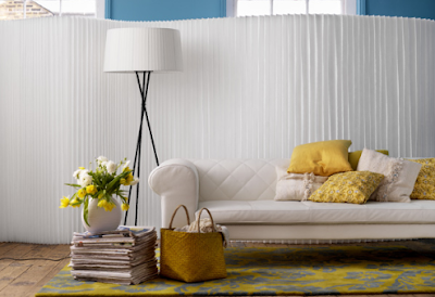 White and Yellow composition in home improvement are used for special person who loved very much in yellow color, white design lover usually used another color to combine with it, yellow color is the most suitable to make an attractive and live room condition. Home improvement can be achieved by designing each room with todays trend continously by renovate or house remodeling.
Wednesday, October 22, 2008
Best Lobby Design from Tune Design


Monday, October 20, 2008
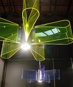
Chinese Modern Lamp Design for Oriental Interior
Curtain Pattern Options for Home Designs Tips

When it comes to selecting curtain fabrics, it’s tempting to go with a solid color. We’ve been told, after all, that using too many patterns will overwhelm a room and make it look too busy. So if you have an upholstered plaid sofa or a pair of flowered armchairs, curtain patterns are a no-no, correct?, Here are several tips:
Curtain Pattern Options
So once you’ve decided that patterned curtains are the way to go, how do you decide what fabrics to use? Fabric patterns generally lend themselves to various styles like formal or modern rooms. Consider the following options:
- Brocade - Brocade is often found in formal dining rooms or living areas. It has a raised design woven into cotton, silk, or wool. Depending on the base material, the brocade will be either medium or heavy weight. Most brocades are floral-patterned, although other options such as fleur de lis do exist.
- Calico - If you’re looking for a more inexpensive and casual curtain pattern, calico might be the right choice for you. Calico is characterized by a small pattern of printed florals on cotton, and it makes a great choice for café style curtains.
- Chintz - If you’re looking for a patterned fabric for a formal room that isn’t as heavy as brocade or damask, try chintz. Chintz is a smooth, shiny fabric printed with multicolored patterns on a lighter background.
- Damask - Damask is one of the most popular curtain fabrics, with a raised pattern like brocade. However, it’s a little thinner. It comes in a variety of patterns including floral and fleur de lis.
- Gingham - Gingham is another casual fabric pattern and is often found in kitchens. It’s characterized by a check pattern, usually light in color, and made out of cotton or synthetics.
- Matelasse - Another heavy fabric with a raised design like brocade and damask, matelasse is generally less formal than the other two. Because of the weaving process, the design of matelasse is less even and more unfinished looking than in the other two fabric types.
- Natural Weaves - In a natural weave, the fibers themselves are rough and uneven, resulting in a bumpy, textured fabric that may have some small gaps. Fabrics may be stiff like canvas or may be even more textured and almost nubby. Natural weaves look great in rooms with wilderness themes or pared-down modern vibes.
- Tapestry - Tapestries depict very deeply textured designs or scenes and usually work best in formal rooms. They also tend to be expensive.
- Ticking - One additional casual option is ticking, a pattern of alternating dark and light vertical strips. Ticking is a vertically striped fabric incorporating a pattern of darker stripes on a light background. Ticking is named after the printed fabric traditionally used to cover mattresses.
Sunday, October 19, 2008
Purple Color for Best Home Design
Symbolism
Paradoxical union of two opposing, red and blue, purple suggests mystery, wealth, but also melancholy and sensuality, according to the dominant that is blue or red. Violet is known because it can help us find inner harmony. In the study of colors, it is considered a relaxing color, but also conducive, favoring female sexuality and creativity! Complex and rich in meaning, purple conveys excellent psychological health!
Violet over the Ages
This color has long been associated with mysticism in the Western symbolism: indeed, in the Catholic religion it is the color of the clothes of the bishop and those worn by priests during Advent and Lent. In addition, it is the symbol of nobility, and it aroused little interest before the 70s, when it had also its revolution in the area of furniture!
Violet, the Alternative to Black Light
Violet has the ability to replicate the simplicity of a black, very popular in the halls or rooms, while offering much greater brightness. With shades of dark and electric violet, it seems clear and stylish. Nowadays, designers use purple quite frequently! This color has become very fashionable and you may wonder why. Violet has the feature that gives an impression of luxury to the simplest items.
Violet in Your Living Room
Violet is very frequently used to dress up rooms: elegant, contemporary, and dense, creating a sober atmosphere and design. Some people use it to the walls of the room: it allows them get black or grey furniture without a depressing result and violet can trigger the impression of a larger space! Indeed, purple, as blue and red, gives a sense of depth to any spaces.
A Violet Office
Purple was recently chosen as one of the most soothing colors. It has thus become the favorite color for offices, since it offers both relaxation and improves creativity.
Can Purple be Used Everywhere?
One might think that purple would not match a kitchen or bathroom. Yet, many people now opt for a soft purple (or occasionally electric) in toilets, corridors or in the kitchen. The most important thing is to create and maintain a harmony between the shades and parts of the house.
What Environments can be created using Purple?
By its wealth of shades, purple matches many colors, but beware! It all depends on the atmosphere you want to create. For a futuristic interior, opt for electric purple, intermingled with black or white furniture, preferably lacquered. For more originality, you can add a touch of bright orange. For a sexy and baroque design feel free to play with colors like plum, eggplant violet, purple or violet-gray with black lace that suggest sensuality! Such colors are perfect for cozy rooms.
Friday, October 17, 2008
Asian Style Bedroom with Black and Red
 Asian styles bedroom are used in almost all around the world, this special style of "feng shui" and another thing about furniture positions had an unique culture. On the picture above, you can see the Asian style especially Japanese and Chinese style. The Japanese cultural style in home design used most natural materials, Chinese cultural style in Chinese used all natural five elements of the earth.
Tropical Teen Girl's Bedroom
 Nowadays, more teen prefer to choose an adult style for their bedroom, Today’s hot new looks are centered around sophisticated, modern or “cool” designs. This is exactly what we are going to present in this post. Finding teenage bedroom design ideas to please the often fickle and fleeting tastes of teenagers and teens can be a challenge, so it is important to come up with ideas that are fun, fresh and easy to change.
 In these days teens actually have pretty good design sense (probably from watching so much TV and reading magazines full of pictures!), all best bedroom design use fresh style and minimalistic furnitures.
Thursday, October 16, 2008
Prefab Home as a new home improvement solution
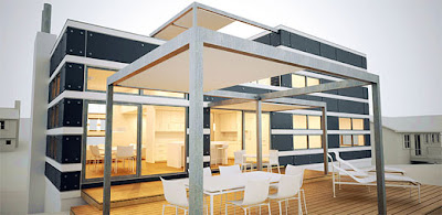 The trend of future home design always tends to create as simple as possible, a minimalist room is a favorite design, all best home design is now using this house remodeling to create a minimalist or antique style. Prefab home is the new home imrpvement solution, it’s minimalist, cheap and trendy. Here’s the H4 prefab home from momoy, I’m impressed for the design. Simple, elegant and have strong contemporary style. Just add with each minimalist room design and furnitures, so you’ll have a modern home in cheap price !
Tuesday, October 14, 2008
Makeover a room with wallpaper

Monday, October 13, 2008
Minimalist Apartment Room Design with Black and White Color
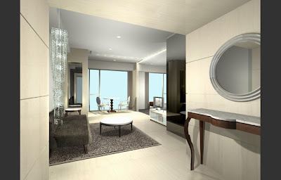 Minimalist room design as a trend of room design use a simple but elegant room designing, completed with minimalist style for the room's decorations, this design use a minimalist space usage in black and white color, finest room compositions, matched decoration's color and other special things.
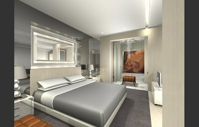 Apartment is one of favorite house who rent by a party for another people, usually a client who want to rent an apartment need a special room that clean looks, simple but cheap enough. This is the K. Wah (China) Investment Co Ltd. Apartment designed by CL3.
Opened Bedroom, a solution for fresh room
 Opened room can maximize the freshness of the house, by opening the rooms widely, we can feel more health by breathing in outdoor fresh air. Complete your outdoor room by planting a lot of trees, so, let the oxygen entering your room for your healthy.
 Enjoying the relax time while morning sun bathing can maximize your conveniences, locate several bench or small chair near your opened bedroom.
 This is a fresh living room near your opened bedroom, feel fresh from the outdoor fresh air. Special ventilation above can reducing the need of room's lighting.
Saturday, October 11, 2008
Centering Interior Bedroom Design
 Look at this elegant bedroom, the use of simple color likes black and white for the bedroom and the wall make the compositions of the room looks matched. The centering decoration by placing the hanging frame and the cabinet with the same style of the right side and the left side. So, this is one of best bedroom design from Design Mind.
Friday, October 10, 2008
Modern Window Design with Rounded Style

 Rounded style for a window is an unique design, on this best window design, we can see a modern interior with natural rounded style. The window used wooden material with the same material for the floor. We will not need an air conditioner, because on this design, the window and the door are very large, we also doesn't need an additional lighting too, because the natural lighting from the window and the door are sufficient.
Thursday, October 9, 2008
Romantic Bathroom with ndividual spectral light combinations
 A romantic bathroom can be created by combining the lighting systems. On this bathroom design you can see a lighting system by combining an individual spectral light combination operated with a gentle push of a button on a control panel on the rim of the bath so the desired effect can develop to its full potential in the course of a relaxed bath. And those who do not want to limit themselves to a particular color can simply opt for the automatic color spectrum which starts a fascinating show of the various colors and lighting effects.
